
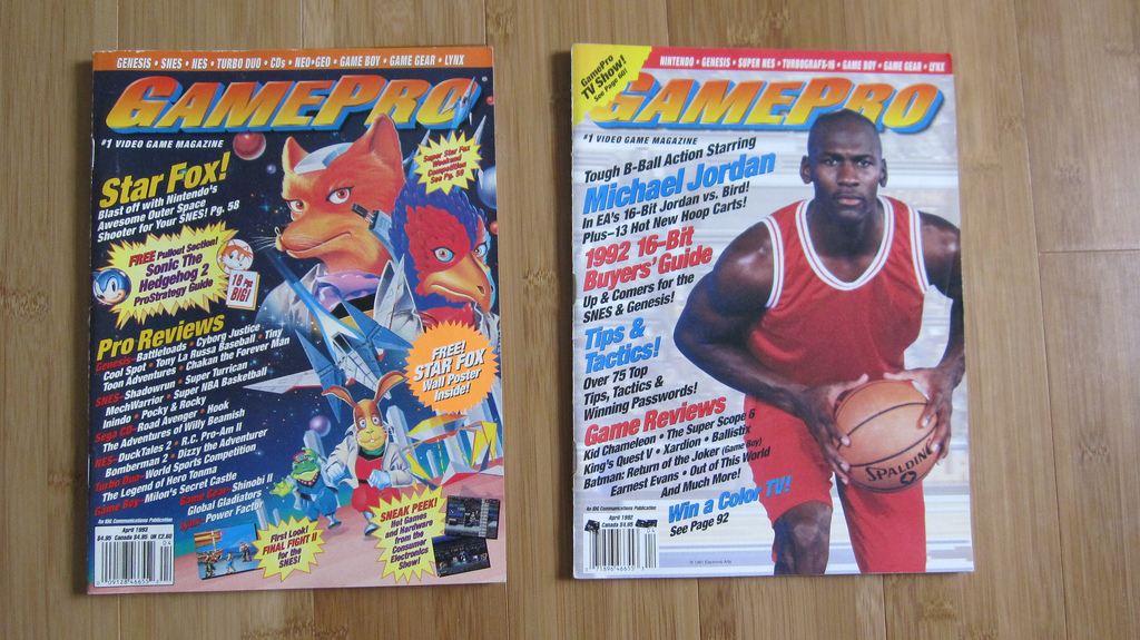
 Several online ads follow a pattern: have the main object (usually the item for sell ) focused on while other items are hidden in the foreground, make sure important text is noticeably different than the rest, and make color scheme that is appealing to eye. These three things are what makes up most online ads, and how they are applied in the image determines on how good the ad is. The text and item can come in a wide variety ranging from being large, small, focused on, and even hidden in the image itself. Both usually let the audience knows what is being sold in the ads, or just take up space in the picture. Colors in ads serve the same purpose as they do in pictures; however, they do have various uses in ads. An example of this is when a majority of the image is darkened while the main item is regular colors, which directs your focus to that item. Ads I often drift to are usually ads that have an entertaining visual aspect to them. The best example of these are technology ads like computers and video game. They often present their selling item in a flashy fashion, a style that would make the viewer say an exclamation like “WOW” or “SO COOL!” The best achievers of this art style are the old gaming magazine Nintendo Power. Almost every ad shown in those books are colorful and appealing to the eye. The most memorable magazines I owned that had excellent ads were the Starfox cover, and the Michal Jordan cover magazines.
U2 B3 how do Ads attract attention
20 Friday Jun 2014
Posted in Uncategorized
